
I finally ended up with some paintings that I am happy with. I have been in a somewhat picky mood and I didn’t feel like posting my last batch of plein air paintings but I felt more in the groove this time around. I could probably bring in more blue to set off that embankment of trees, I might go ahead and do that, maybe not!

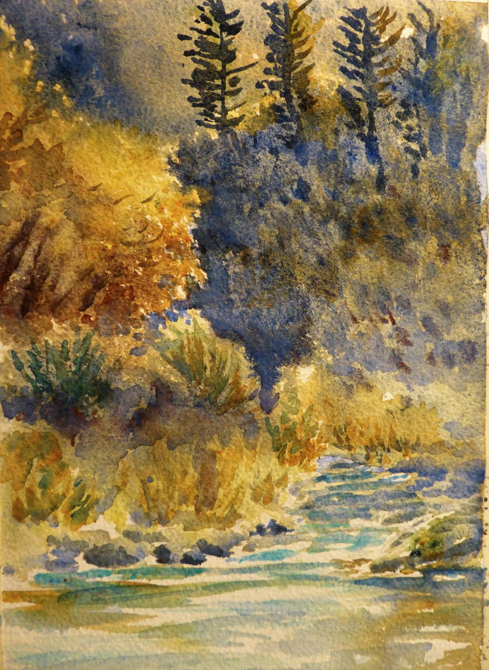
My photo was at a slant, I didn’t realize it until I uploaded it….no, I didn’t paint it crooked. I decided to have another go at the same scene. The colors on those oaks on the left side was very difficult because fall is already coming and the colors was this wonderful yellowish gold.
I decided to go simple with the river, I have a tendency to try too hard to capture the river and I usually over-paint it. I am purposely going simple and will continue to work it slowly up in order to teach myself how to capture it well enough.
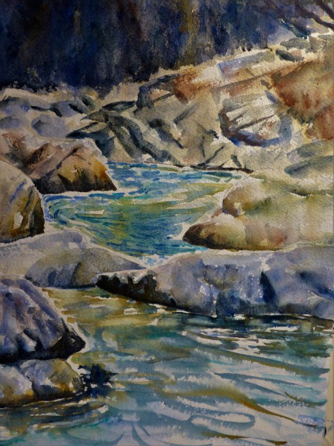
It was so difficult to capture this scene because of the rocks looking pretty much the same and in full sun except for the foreground rocks. I loved the color of the river, so beautiful and also hard to paint. That bend goes around to a large rapids which is referred to Maytag to the locals here.

I didn’t quite bring in enough dark on the foreground but I am not too worried about it because I always have another day to try. I am trying to become more relaxed about not expecting to get a perfect painting each and every time I plein air paint. After all I am after feeling and a sense of place.

This photo shows too much blue, keep that in mind when viewing this. I was running out of steam when I did this painting and I struggled with the values and I am not too worried about it as I plan to do a studio painting of this scene but on a larger scale and more of the background as well.
I didn’t go as abstract as I wanted, again I was pulled in by the mechanics and the elements. I had planned on doing some charcoal studies but I was too anxious to get to the watercolor, maybe next time.
Learning Points:
- Again it takes up to 30 minutes when your “artist eyes” kicks in.
- Don’t judge as you paint especially during the warm-up stage when your eye to brain to hand is trying to coordinate.
- It is alright to take a painting back to the studio to finish, I did!
- I encourage artists to get out and plein air paint, as I painted in the studio I was mentally out at the scene finishing up. I used a photo reference but my experience allows for my memory and imagination to take over.

Wonderful work, I love the view in the top one, and the colours…you have been busy 😀
LikeLiked by 1 person
crazy busy, thank you!
LikeLiked by 1 person
Wonder Wood and River – Perfect Work, Margaret !
Aleks.
LikeLiked by 1 person
thank you! Aleks 🙂
LikeLike
Wow. These are amazing Margaret. I especially love #1&3! Colors. Composition. Beautiful !!!!
LikeLiked by 1 person
oh thank you! I wasn’t sure….I never really know unless I totally love them 🙂 I always appreciate getting feedback.
LikeLiked by 1 person
Nice group of paintings!! My personal favorite is painting #3 love the way you handled the water flowing through the rocks !
LikeLiked by 1 person
thank you Louis! love getting feedback, it really helps 🙂 I could easily paint at this location 100 times, one of my favorite places to paint.
LikeLike
I love this post. Great Learning points for us all!!
and it is so true…. First, we ‘warm up’ and then we’re on a roll, but after awhile, we are all out of steam!! we’re DONE. so true.
thats the way my paintings reflect as well. your #3 (is on A Roll!!) is very well done, the water, lights, tones, are in beautiful Harmony.
LikeLiked by 1 person
Thank you Debi!
LikeLiked by 1 person
any time! how was the girls’ nite? fun I bet!
LikeLiked by 1 person
hehe…..reading and having some girl time with two lap cats…..now that is exciting! lol
LikeLiked by 1 person
my kind of party night, M 🙂
LikeLike
Me too, big fan of #3 – you have been super productive and your efforts are paying off with your satisfaction with your work which as you can tell from your fans is equally admired!
LikeLiked by 1 person
aww…..thank you!
LikeLiked by 1 person
You definitely capture atmosphere and/or a sense of place in your paintings. Particularly liked painting #1 and #3 – they are wonderful!
LikeLiked by 1 person
Why thank you! easy when you have an inspiring environment to create in 🙂 I keep pinching myself and counting my lucky stars every time I get out there.
LikeLike
Very lovely indeed. 🙂
LikeLiked by 1 person
Very nice, Margaret! I like the first one best for it´s rich texturing and the almost ´golden´colors.
LikeLiked by 1 person
thank you Carsten….that color was hard to depict….fall is coming!
LikeLiked by 1 person
Wow! You should be very happy with these!! They’re gorgeous!! 😍
LikeLiked by 1 person
Thank you Charlie!
LikeLiked by 1 person
Great work. I especially like #3, and it is interesting how the dark lines on the rocks form a semi-circle starting bottom and then leading to the left and up. Was that done consciously? I am also intrigued how you hold the values in check – often photos exaggerate the value range. I noted that these are all quite small – if you put them down and look at them across the room only the essence should remain – it could tell you whether to push the value range more or less.
I think particularly in #1, you should see just light and shadow, which takes you to the essence of that painting – in my opinion – since your colors are beautiful but low key (I cannot get enough of that goldish ochre green you have in most of your paintings).
LikeLiked by 1 person
Hmm…..I guess it wasn’t consciously done on that rock, interesting….not sure why I did! I took everything to about 80% and finished in the studio, I am guessing on that figure. I think that is where being out there so much knowing the scene and how it was on that day holds through my session in the studio. I did rely on my reference photos as a notation only but used my memory for that finish. I really like you suggesting that I look at them from across the room for the “essence test”. I have never heard of that before and I think that I’ll use this trick in the future, thank you! I am always concerned about values and many times it is a hit and miss. And truly that gold ochre green was so fun to paint but so hard to depict, I could easily go back and try it for the next month or more before they turn….and that would be even better….more color! lol
LikeLiked by 1 person
You cannot go wrong with this rule:
The 30, 3, 3 Rule:
A painting should grab your attention at 30 feet away.
At 3 feet away, the painting should tell a story and create a dialog with the viewer.
3 inches away, the painting should be interesting to other artists with interesting texture and paint application
Source:http://www.finearttips.com/2011/04/my-week-with-master-landscape-artist-michael-workman/
LikeLike
Margaret, see the 30-3-3 rule, which you can find on this link: http://www.finearttips.com/2011/04/my-week-with-master-landscape-artist-michael-workman/
I tried to post this comment but it did not work. Will try one more time!
LikeLiked by 1 person
ah! I will write this down and use it as a guide…..thank you!
LikeLiked by 1 person
Beautiful!
LikeLiked by 1 person
thank you Jill!
LikeLike