

The idea for this painting came to me the other night and I knew exactly how to paint it from start to finish, of course I knew how to paint it intuitively, that is! Here are my other two Moonlight paintings: Moonlight Abstract #1 and Moonlight Abstract #2 and Falls
I originally envisioned my being able to “twirl” my board and do some crazy paint flinging but I had to improvise and tilt my board to make it go like wild. I added water here and there to get the paint to move and I used my sprayer to make some texture. I re-emphasized the red dots and dashes for a little boost.
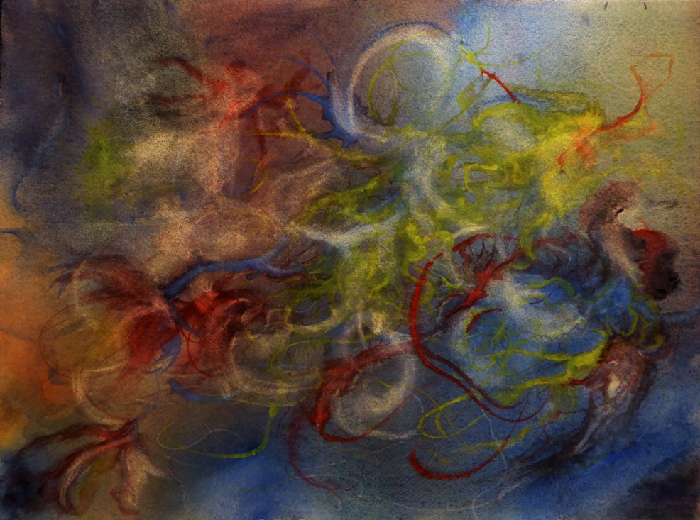
My husband wondered if that area to the left with the curved band needs something. I told him that it gives a resting area for the eye but the more I look at it, I wonder if it could use a thin dark blue band. What do you all think?
technique: saturated wet on wet, Daniel Smith colors used: Quin. Red, Hansa Yellow Md, Ultramarine Blue, Indanthrone Blue, Indigo and Moonglow.
I love the softness to this one and yet it needs some “zing” and at the same time, I love it the way it is. I might let this sit for a spell and maybe I’ll add more to it or call it finished.
Technique: saturated wet on wet. Daniel Smith colors used: Quin. Red, Hansa Yellow Med., Cobalt Blue, Moonglow
*A word about photos. The photos on my blog are mine, taken by me and copying them would be stealing from me. If you find a photo that you would like to copy or use, I request that you ask me for permission and I expect you to give me full credit for my own photo. Thank you so very much.

I love that first painting. It’s very dramatic and I wouldn’t touch it. You are on a roll!
LikeLiked by 1 person
Thank you Flora! I think that you are correct, I won’t touch it. 😉
LikeLike
Wow!!! #1 is awesome, #2 is beautiful, too. But I love the dynamic power of #1.
LikeLiked by 1 person
me too, I love drama, so it really appeals to me. Thank you!
LikeLiked by 1 person
Bold. and Beautiful is the first one. then the second is softly singing, I think!!! way to go Miss M! i am partial… to the 2nd. and letting it sit a spell while pondering what it may need to bring up a tiny bit of it sounds like a grand idea! MMM marvellous Miss M 🙂
LikeLiked by 1 person
hehe…..I am learning to ponder and gaze at them and not be so ready to do something….waiting is golden.
LikeLiked by 1 person
and …. The River, calls again. can’t wait to see more pics as you hike the shores and paint your interpretations 🙂
LikeLiked by 1 person
I am hoping this Friday….I hope! the weather is cooperating, finally!
LikeLike
They are both really wonderful — the second one is my favorite of the two, I think. They are very different so it’s kind of apples vs oranges. I think that’s wonderful also that you produce two works so different, each very strong in its particular way — one through boldness and effect of brilliant light and the other through intricacy, muted color and subtlety.
LikeLiked by 1 person
I like to swing that pendulum, that is for certain. As much as I love bold, I like that quiet spot of the creative spirit. 😉
LikeLiked by 1 person
That’s one of the things I love about your approach — you’re not afraid to experiment. I like to go back and forth between ideas. And you do so in a brave way. How else will one find ideas except by trying different approaches and seeing where they lead … and sometimes … as here … the discoveries are wonderful.
LikeLiked by 1 person
Exactly! sometimes you just have to jump in and see what happens. 😉
LikeLiked by 1 person
I adore the first one. The colours are amazing and well balanced. Did you choose them intuitively or did the idea of harmony and balance play a role in your choice ?
LikeLiked by 1 person
Since this was part of the series, all I knew was that I would have a whitish center and yellow or orange or both. Then I went from there and it was all by intuition. I will explain that more on my next intuitive painting. Thank you by the way, your question prompts me to think about sharing my process more.
LikeLiked by 1 person
Nice colors, very abstract. I love it!
LikeLiked by 1 person
Thank you!
LikeLike
The second one really draws me in. Feels like a dream, very surreal. First one is dramatic, I see moon and trees and it’s certainly interesting, but the second in the more muted tones feels more like “me”. Very cool to see the abstract side of your work and the series with the moon. 💜
LikeLiked by 1 person
Hi Laura! I was hoping that you would drop by…..I just completed another semi-abstract. I am discovering something very important about my approach and it really hit me today as I was “trying” to seriously paint more realistic and it wasn’t moving me until I abstracted it. I will be posting about that soon. 😉 thank you by the way!
LikeLiked by 1 person
Oh yay! Sounds the way I’ve been feeling lately too. Wow your stuff is popping, lady!
LikeLiked by 1 person
I aim to “pop”! lol
LikeLiked by 1 person
😃😃😃
LikeLike
So very much beauty to take in here Margaret!!!! Bravo!!! The drama of 1 is so striking and bold and compelling. Don’t touch that corner as it is a good resting spot for the total exhilaration of the rest. 2 is so soft and lovely. I really love it too. Such great work Margaret! I am swooning!!!!! 😊😉
LikeLiked by 1 person
hehe…..thank you! I am on a roll!
LikeLiked by 1 person
you sure are!
LikeLiked by 1 person
I’ve no idea when it comes to painting (when I’m working on a written piece, sometimes I have to stop and come back to it later to see if it is “finished” – and still can’t decide) but your paintings here seem finished! Have fun with them, whatever you decide!
LikeLiked by 1 person
Thank you!
LikeLike
I do love these.
LikeLiked by 1 person
Pingback: Moonlight Series #4 – Yuba Gold