

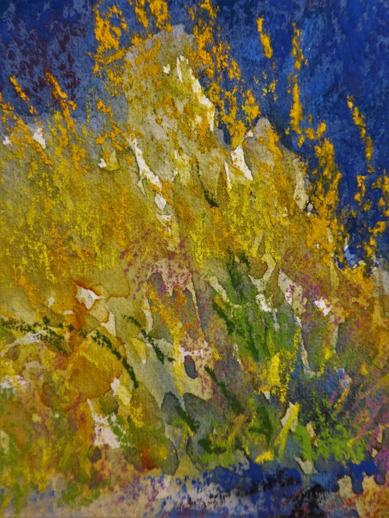
I had a blogger suggest that I darken the background of this painting and I did though I decided to go ahead and turn it into a watercolor to pastel painting. Sure I could had gone darker in the shadows but I didn’t want to fuss with it too much but focus on the light and the gorgeous yellows and golds. I punched up the color than what I saw in reality.
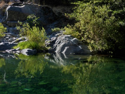
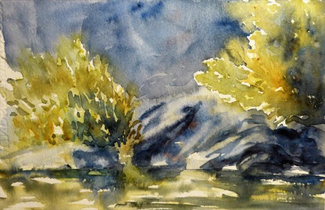
Looking at that photo and comparing what I ended up with, I could probably could have worked on the water more but to me the focus was on the rocks and bushes. Oh but look at that water!! Oh well, perhaps another time. My last experiment with this idea of putting pastel on top of a watercolor didn’t go as planned and it was mostly a pastel painting. Pastel of Goose Lake
I probably rushed this painting but I feel that I wanted to have a go at it and see what happens. I might go back and tweek it a bit more and then again, I might leave it alone.
*A word about photos. The photos on my blog are mine, taken by me and copying them would be stealing from me. If you find a photo that you would like to copy or use, I request that you ask me for permission and I expect you to give me full credit for my own photo. Thank you so very much.

Oh poor you suffering with a headache, I get the damn things too, and I am impressed you managed to get Somme art done. I love the colours that your camera shows, the colours work so well together, I do love the rich tones from pastel, so pure ❤️❤️. That photo of yours really captured a beautiful moment, the reflection is stunning……go away headaches!!!
LikeLiked by 2 people
thank you…..I detest them at least it wasn’t a migraine. I have had some pretty bad ones, the kind that keeps you moaning in bed hoping to die! I could had worked on this pastel more but I think I wanted to feel like I accomplish something! lol
LikeLiked by 1 person
I know those horrid migraines, moaning in bed, eeek, lights out, yes….I now take maxalt melt, they work wonders for me, prescription only!
LikeLiked by 2 people
Margaret, That dark background really makes the bushes and rocks sing.
LikeLiked by 2 people
Thank you Graham…..a good decision to use it for this exercise and thank you once again for that prompt to take it darker. 😉
LikeLike
SUPER!
LikeLiked by 2 people
thank you!
LikeLike
wonderful use of the two media together — beautiful picture — it’s as though you invited your two best friends to celebrate together
LikeLiked by 2 people
Thank you Aletha…..I think that I should have worked it a bit more thoughtfully but at least it was a good exercise. 🙂
LikeLiked by 1 person
Lovely, lovely, reference, Margaret – it’s good to experiment with such things and also, go back later and revisit.I really like what you did with the water in the watercolor painting! Maybe you will revisit this in Acrylic???
LikeLiked by 1 person
Thank you…..a good idea! I have oodles of pastels and of course now watercolors that I can translate to acrylic. 🙂
LikeLike