

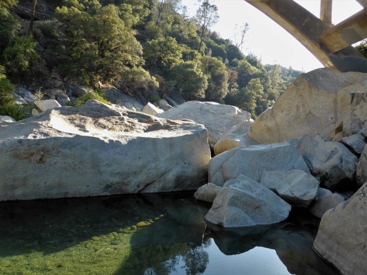
I remember crossing this bridge as a youngster coming up for family vacations to visit my grandparents and family back in the ’60’s and 70’s. Before the new highway was built I believe in the late 70’s, driving Hwy 49 was treacherous. I remember going around corners, my Dad often would honk the horn because of the truckers taking a wide berth. Come to think of it, this road is still quite deadly. I haven’t been down to this part of the river in years, I focus more on the North and Middle Yuba. What a beautiful day to paint, I was the first to arrive.

I was pleased with the beautiful lighting and the rocks of the South Yuba is very different from the rocks of the North Yuba. Subtle colors with a lot of granite, I believe. It felt like painting an egg study.

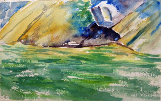
I decided to bring out more texture later in the studio, and added a little more depth to the water.

I tried my best to marry up my photo to my painting. Bear in mind that those yellow/gold areas are not blotches of green/gold but subtle and more like light washes of color. The blue is not as sharp. No idea why I had a difficult time, usually I can get my photo spot on.
Now to the painting. My shadow under the rock on the bottom right was the hardest part to paint. Whew….Now I know I should have soften up edges but with this kind of rock formations, it is something you do want to delineate otherwise, you have one big mass with no definition. I will work on this in the future, softening edges that benefits the painting without losing form.
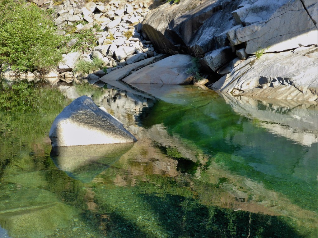
The blues are not as rich in my painting and the yellows are more subtle not so acid as in this photo. I had another difficult time getting the shadow correct on that over-hanging rock, something that I will be practicing in the next months.
My Learning Points:
- I need to venture to the South Yuba river more often!
- It is alright to take a painting back to finish. I have had this idea that I need to finish on site because of a belief that I will lose freshness. I have decided this is not true, over-working is when I lose freshness.
- I only touched up areas that I felt would enhance the painting and no more….I repeat NO MORE…so tempting to make it even better.
- I love rough paper, it makes dry brush work easy.
- Practice shadows on rocks!
Get out and Paint en Plein Air….you can thank me later! Remember doing this kind of activity heightens your keen artist eye.


The old bridge is very beautiful. I love old bridges! Looking forward to see more art from the river 🙂
LikeLiked by 1 person
yes……my favorite place to paint 🙂
LikeLiked by 1 person
What a view is right! You sure tackle it well, Margaret. I admire your “rock climbing” skills with your watercolor brushes!
LikeLiked by 1 person
nobody rocks plein air like you Margaret! Awesome paintings!
LikeLiked by 1 person
thank you Jodi, you just made my day!
LikeLike
It’s clear that you were having a great time and were totally engaged. It shows in the watercolors, each one very strong. What an amazing and beautiful place to work.
LikeLiked by 1 person
Thank you Aletha! yes…..I love it there so much, so peaceful but it is also a popular place to swim. People started showing up early to swim, like 8:30 am! I guess I can hang with that, I am too spoiled by the quiet of the North Yuba.
LikeLiked by 1 person
these are magic! love #2 especially! I really, do, live vicariously through your trips to the river! lol I feel so ‘at home’ it is so odd. sad.
But, Grand!
#3 the river green and rushing speed is conveyed with such Authenticity 🙂 #2 appeals so much; its not JSSargent… it is Margaret! but, is reminiscent! it is a wonderful Lovely painting from the heart. and, would it be possible, at some time – to take some river pics, for me to create from? if not, ok. it is your river!! you dibs it LOL
thats not a ‘normal’ thing for me, you know! somehow, I’ve ‘connected with that darn river though! how’d that happen? anyway, think about it…… 🙂
LikeLiked by 3 people
Thank you Debi! I can always rely on you for a good “view” of what I produce. I don’t have to think about it (sharing my photos with you), not one bit. I have oodles of photos of the river. I think that I have literally taken several thousand and post only a toenail of my favorites. If you become friends with me on Facebook, I have quite a few on there as well. If you are looking for something in particular, I can rustle up something that fits. I think that you have “Yuba Fever” lol believe me, there is no cure because it just intensifies! 🙂
LikeLiked by 1 person
my pleasure M! I’ll return to fb to double check this… thought i did? gues not. getting old! lol and this river is addictive, its the color, clarity, the surrounds, the rocks. hmmm. all of it! just wish…. I could Really be there. someday.
LikeLiked by 1 person
I have several albums with a load of river photos….I might have several as private. I only allow certain albums to be “public”.
LikeLike
Always a pleasure to view your work and enjoy all your excitement around painting and being outside. A beautiful place, indeed. Love the color choices for the shadows in the reflections of the water in all of these paintings. Just wonderful.
LikeLiked by 1 person
Thank you Carrie….I appreciate your comments and your visit 🙂 how is the North Coast? I haven’t been up there since the year before last, we skipped a year 😦 I hope to make it up there this year. By the way, I am following you but I never see your posts on the feed, no idea why. Anyway, thank you again for your kind words. 🙂
LikeLike
Not sure why you don’t see me sorry. I’ve heard some people having problems and needed to re-follow for some reason.
You are most welcome 🙂 All is good here, beautiful foggy mornings and lovely sunny evenings. Summer is beautiful here. If you do find your way here please let me know. It sure looks like you find lots to enjoy where you are!
LikeLiked by 1 person
I will be sure to let you know 🙂 I wonder if I can subscribe and get an alert to your posts, I’ll look into that!
LikeLiked by 1 person
I love the rocks you did such a beautiful job i love the sharpness and light in your paintings just great interpretation of your beautiful photos of this river! Great work! ❤
LikeLike
I tried rocks once and they weren’t pretty…lol…I adore the colors and shades you use to paint yours. 😍I keep studying these for tips and inspiration. Thanks for that!
LikeLiked by 1 person
keep trying…..these were very tricky….I forgot to write about how difficult it is to get the right mixture to get that grey. Either I put in too much red, or blue or yellow! but when I hit it, boy, it is great. 🙂 I had the most difficult time! I am hoping to re-visit it here and keep at it.
LikeLiked by 1 person
Oh again what a view, you are so good at water, I love #1 and #3 the water colours are fantastic. I always wish I could visit for those views…. Not that I can paint landscape, I just like looking , I would be so easily distracted, you must get into a real zen space while painting ❤️
LikeLiked by 1 person
I do and sometimes I shake myself awake and either it is time to leave or there is enough time to make another painting! thank you Rebecca for your comments. 🙂
LikeLiked by 1 person
Beautiful spot to paint in – and you really got those great colours in #3
LikeLiked by 1 person
I love them all but just when I had decided 2 was my favorite I scrolled down and found 3 and fell even more in love with that one! You really have this river down and rocks and …… My learning point from your post is that I need to try that rough paper I bought! Bless you, Margaret, these photos and artwork are stunners!
LikeLiked by 1 person
I’ll be working on getting that granite look which is hard. I either go too blue or too green. On the North Yuba, you get rocks that have burnt sienna, ochre, green or even black! I am spoiled by those rich colors but like I mentioned in my post, with these rocks it feels like painting an egg study. So fun to hear from different people which paintings are their favorites. I had the most fun with the first one. I think because it was exciting to be there and I was having fun bringing out the lights and darks. thank you Laura for your comments and encouragement, it is a big booster 🙂
LikeLiked by 1 person
I’m so glad I can boost you, Margaret – it is soooo easy to do! You rock! And thanks always for the same, you make me feel awesome all the time!
LikeLiked by 1 person
Oh I forgot…..yes, give that rough paper a try, I love it especially doing dry brush, the best!
LikeLiked by 1 person
Will do! Thanks!
LikeLiked by 1 person
WOWZA! The scenery is lovely but your colors are FABULOUS, Margaret! Love what you did here! And I will have to try some rough paper. 🙂
LikeLiked by 1 person
yes….give it a try, it gives an added sparkle if you work with the roughness of the paper. Thank you Jill for your comments, very much appreciated 🙂
LikeLiked by 1 person
Reminds me of Johnson’s Shutins in Missouri. Nice work on those rocks. I need to paint more rocks.
LikeLiked by 1 person
thank you! I’ll look that area up, always love to see what is out there even if it is across the nation.
LikeLike
wow……Johnson’s Shutins is beautiful! I could paint for months there!
LikeLiked by 1 person
#2 is my fave. This looks like a place that abstract photographers would enjoy too, I know I would! I hope you do re-visit #3, as I’d particularly like to see a version showing only the top-third as those shapes and greys/blues are fabulous, so graphic!
LikeLiked by 1 person
I probably will visit this spot often and give many views and many tries….thank you for your comments!
LikeLike
These are so beautiful again, Margaret! I reallly love the way you rendered the light on the rocks and gave them a shape in such an effective way. The way the river turned out in #3 is awesome – with the light sparkles in the front (probably done with a dry brush? ). Looks great and i can feel your Passion for your favourite subjects! I plan to go out for plein-air painting this Weekend, too. The weather-forecast is promising. 🙂 Happy painting!
LikeLiked by 1 person
thank you Carsten! yay for plein air painting and especially for good weather!
LikeLiked by 1 person
Beautiful post and paintings by you Margaret. I thing the bridge and rocks with that character of light should provide enough material for a whole exhibition. You really have an eye for taking good reference photos.
I think your attitude of learning points is your best asset, always moving forward, seeing each painting as a learning opportunity and not as an answer to the eternal question: “Am I good enough?”
I recently bought a big A3 pad and some chunky charcoal sticks, very cheap. And I found it is a very good way to make value studies without feeling too precious about the outcome. It encourages working fast and also getting the big masses right.
I read somewhere the order of skills are: composition, large masses, drawing, values, colour. I think you have most of these nailed down to a good extent. You definitely have a brilliant eye for composition, and if that is not there, you cannot go anywhere with art. For me, and I suspect most others, color remains the most elusive aspect to master, a lifetime learning process!
Great post, thanks for sharing!
LikeLiked by 1 person
thank you for your comments, so much appreciated. I struggle so much with seeing values, it is a hard little bugger that keeps evading me. Once I get the comp. figured out, it is lighting and of course that elusive values! I think I could paint there for a very long time, a Monet’s garden for me.
LikeLiked by 1 person