
I painted some on my intuitive painting here and then decided to have another go at translating a pastel painting to watercolor.
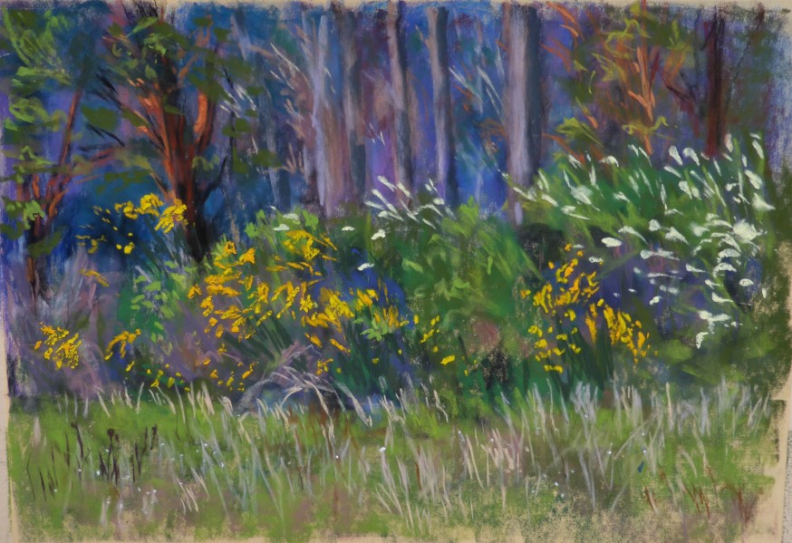 The pastel painting above is from this post Paint and a Hike
Using the other side of a failed painting on 300# Fabriano Artistico rough, I painted without drawing, sometimes you have to jump in and see what happens. The less I worry or anticipate success or failure, the better I feel about the painting process. I quit when I started to get picky, that is a sure sign to back away and leave it alone.

The yellows are more brilliant and not as blotchy and the background with the trees is a bit lighter than it appears in the photo.
My learning points:
- I can create some blaring flower cutouts after all, it takes some softening and working with these cutouts to manipulate what I want (the yellow flowers).
- I don’t need excessive detail to convey a painting to my audience.
- The brain fills in the blanks, we all do this naturally, it keeps the viewer engaged when you leave some areas for their brains fill in, isn’t that just brainy?
- Cadmiums are valuable but use with caution, they do bring some oomph when needed but don’t bring out a shotgun (cadmium) when a .22 (transparent yellow) works better. Cad. yellow was a shotgun that I needed!

Gorgeous yellow flowers! Beautifully done… I love the abstraction of the watercolor version. It gives it a really wonderful atmospheric sense that’s lovely!
LikeLiked by 1 person
thank you Charlie! I gave more flowers than the original but I kind of like that 🙂
LikeLiked by 1 person
Loving the colors in all the paintings. Beautiful.
LikeLiked by 1 person
thank you 🙂
LikeLiked by 1 person
What is the first picture I am seeing of something that looks like a green wave. It’s very soothing. I saw it on the banner of your blog also.
LikeLiked by 1 person
I accidently attached that and now I can’t seem to remove it……it is a wave from a photo that I took of the North Yuba river. 🙂
LikeLike
More flowers – always best! Very nice …
LikeLiked by 1 person
I love it!!! Wonderful and atmospheric color composition – and the looseness is great!!! The backside of the Fabriano paper seems to be at least as good as the front. I made kind of the same experiences with the cadmium yellow. It is really good for some little eye-catchers, but it is a bit dangerous to use, because you you have to be careful with it – too much of it and the painting goes to the dumpster. But with your flowers it stands out great!
LikeLiked by 1 person
thank you Carsten! I have had that cad. yellow forever and rarely use it, in fact I am a little scared to, but in this case, it was perfect. 🙂 I haven’t noticed a difference between one side of Fab. versus the other, so no loss.
LikeLike
amazing accomplishment margaret! exquisitely executed and not an easy thing to do!
LikeLiked by 1 person
Thank you Jodi! helps when I set aside fear and my expectation.
LikeLiked by 2 people
Wonderful painting. Very atmospheric and poetic. Looks like your instincts are spot on! Sometimes can be wonderful to revisit a motif and pull from it all kinds of different moods and effects.
LikeLiked by 1 person
So fun to now have old plein air sites to re-visit with watercolor and old plein air paintings as well! Soon I will have to get those oil pastels and a way I will go, re-re-visiting, again! lol
LikeLiked by 1 person
Oh, and arrrrh, loving these, really fantastic work.❤️
LikeLiked by 1 person
thank you!
LikeLiked by 1 person
I like the comparison and contrast of the two mediums. Have you tried combining them? I enjoy watercolor underpinning on the right surface.
LikeLiked by 1 person
I have in the past, I will have to give that a try again at some point. I love giving a watercolor an extra sparkle with pastel. 🙂
LikeLike
Underpainting.
LikeLiked by 1 person
gorgeous paintings Margaret 🙂 love your learning points!
LikeLiked by 1 person
Those cad flowers are perfect in that piece, Margaret; wonderful contrast against the dark woods behind. Love the pastel piece too! You talented lady!
LikeLiked by 1 person
thank you Laura!
LikeLiked by 1 person
Beautiful painting Margaret! Last point was valuable!
LikeLiked by 1 person
Wonderful paintings, these! I honestly cant decide which I like more. The slight abstraction of the watercolour sways me its way though! ♥
LikeLiked by 1 person
I am finding that abstraction is more and more up my alley. I tend to go “left brain” with tedious painting. Plus with the kind of painting that I do lean towards, it keeps the excitement and interest up, which for me, is a win-win situation.
LikeLiked by 1 person
Your pastel is gorgeous! You are so talented! You seem to be developing a real style with your watercolors. This one is really nice. Yes, it’s all about illusion and letting the viewer’s mind “fill in the blanks” as you so aptly put it. I’m learning that with my paintings, too.
LikeLiked by 1 person
Thank you Judith! I really appreciate hearing that, I often spit and grumble about my art, good to hear how it comes across. 🙂
LikeLiked by 1 person
How long have you been doing pastels? I enjoy soft pastels, but I’m not very good with them yet. I’m amazed by the detail you’re able to create with your pastels.
LikeLiked by 1 person
I started seriously (with some starts and stops) since 2000. It was a love/hate beginning. I had to get used to getting my hands dirty and it was difficult learning to layer and how to get to a finished painting. It takes a lot of working out, as with any medium. I love it and especially the vibrancy but the framing costs are outrageous and a lot of framers require you to spray with fixative. I have a framer who charges me a fraction of what is costs elsewhere. He is in his late 70’s and I know at some point I won’t have him. With watercolors, I can basically do my own framing. Pastels requires a certain way of framing them. Anyway, I do love pastels, I was just thinking the other day that I need to go plein air painting with them. 🙂 they probably feel neglected.
LikeLiked by 1 person
Have you tried the pan pastels? I like the effects of soft pastels, but I hate getting my hands dirty, not to mention the clothes I’ve all but ruined while using them. When I heard about the pan pastels, I ordered a small set, and I love them. It’s almost like “painting” with pastels. No messy hands! Of course, you’re accustomed to using the soft pastels now, so there’s no reason for you to change. You’re so good with them! When I was at Coldsnow’s (the big art supply store in our area) I tried out the Sennelier soft pastels. Oh, I loved those. I’m caught up in watercolors now, but at some point I’d like to do more soft pastels. I love the luminescent effects of the colors.
LikeLiked by 1 person
I have tried the pan but after so many years of manipulating and yes, getting my hands dirty with pastels, the pan pastels seemed a little too “posh”, kind of insipid if that makes any sense. I love Senneliers! esp. the white because it so brilliant and that last icing on the cake. Since they are so soft, I use them for highlights or a dab of brilliancy. I also want to move away from using so many pastels because after a while of using them, I get this numbing sensation, not so much if I plein air paint. It has been a concern so part of why I am moving to another medium, in this case watercolor.
LikeLiked by 1 person
With your talent in pastels, I can understand why the “pan” pastels would seem a little less desirable. I hope you’re able to continue using pastels, though, at least occasionally. It would be a shame to let your talent go unused.
LikeLiked by 1 person
thank you…..I will use them en plein air and limited time in the studio. I think breaking up my time spent with them will help with the health issues.
LikeLike
Beautiful and inspiring
LikeLiked by 1 person
Really well done Margaret! The yellow is beautiful. I don’t use cads much but they are beautiful. I read the described as a drop of a jewel to put into a damp wet in wet, just a bit, to make the area of foliage sing. I am not at home now, so I don’t have the title or artist handy.
LikeLiked by 1 person
thank you!
LikeLike