

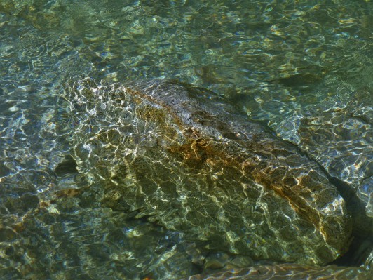
I decided to go try out further upstream from the spot that I painted Daring Watercolor #16 . I should had arrived even sooner because I had only about one hour of the best lighting.


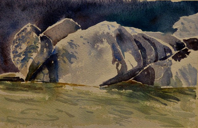
I have several areas that I don’t care for….on painting #1, there was a large amount of blue paint that settled in a valley and then dried, leaving a blue strip. On painting #2 the rock on the left with the shadows doesn’t seem to have enough value range and just “sits there”.
My learning points:
- Fun to charge in Cerulean blue to watch it boss other colors around. So far the only color that I have discovered is as “bossy” is yellow.
- Don’t be timid to put down bold dark passages and forego the typical watercolor technique of light to dark. With my squirrel hair mop saturated with water, endeavor to connect the shapes and watch magic happen. Fun!
- Allow the colors to mix on the paper, charge the wet paper with color.


Man, Margaret! So much to like about both paintings that it’s hard for me to choose. My first instinct was the second because I love the way you adapted the actual scene to make a more powerful painting with better contrast. But then I looked back at the first and it’s a very close second because I love all of the color and light and how you broke down a fairly complex scene! Seriously, you are rocking the watercolors, I am very impressed! Happy Memorial weekend to you! ❤️💙❤️
LikeLiked by 2 people
I know…..I am excited and my eyes are hanging in there. I am teaching myself to take care of them. I love your insights and exactly how I feel about both paintings. Yes, I did choose to go with a stronger contrast on the second one….I love watercolor! Yippee! lol Hey, check out this song….I have been listening to it over and over. http://www.bing.com/videos/search?q=kristene+dimarco+i+will+follow+you&qs=SC&sk=&FORM=QBVDMH&pq=kristene%20dimarco%20i%20willfollow&sc=4-29&sp=1&qs=SC&sk=
LikeLiked by 1 person
woah….did that link go off the page or what? I didn’t know of any other way to share it with you. 🙂
LikeLiked by 1 person
It worked!
LikeLiked by 1 person
Wow, that’s really pretty. She has a haunting voice! Does that band have other singers too? My daughter used to be really into them but her voice isn’t familiar for some reason. I could see where you could put this one on repeat! Glad your eyes are behaving and that your paintings just keep getting better and better! 💛😎💃🏻👍🏼
LikeLiked by 1 person
yep…..I even pinned it to start that way I can listen to it to my heart’s content. 🙂 Have a wonderful Memorial weekend! and my eyes better behave because I have a lot planned. Oh boy!
LikeLiked by 1 person
You did an amazing job! I know a place just like this in British Columbia!
LikeLiked by 1 person
Why thank you! where in BC? I love it up there. 🙂
LikeLike
Sunshine coast placed called eagel river I believe 🙂
LikeLiked by 1 person
I’ll check that out….by the way, I know that you’ll appreciate that song link on my reply to Laura up above…..I keep listening to it over and over…..love it. lol nothing to do with our discussion but hey, I am bursting with loving the song, what can I say? 🙂
LikeLiked by 1 person
There’s another reply ^^ up there too Margaret. Also you might wanna check out Artistcoveries blog for a cool site you’ll wanna know about! Judith is rocking the gesture drawings too. 😀
LikeLiked by 1 person
oh I will…..another place to weary my eyes! I love gesture drawings….I go take a look see. 🙂
LikeLiked by 1 person
Marvellous 🙂
LikeLiked by 1 person
I nominated you for a Liebster Award on my blog – check it out! https://sandsaltmoon.wordpress.com/2016/05/27/4688/
LikeLiked by 1 person
Alright! 🙂
LikeLike
I would like to do this but can’t get to it until tomorrow….is that going to work? is there a time limit? Thank you for nominating me by the way! 🙂
LikeLike
Totally – Snehal took a whole week! I suppose I should have written to do at your convenience!!
LikeLiked by 1 person
Whew! good….I’ll take a bit longer then. I want to give this the attention it deserves. 😀
LikeLiked by 1 person
Your paintings both have a lot of energy about them. The water seems to be rushing right across the page. These are beautiful, Margaret. I like the up-close focus on the rocks, but I like the first painting, too. I think they need to be kept together as a set. 🙂
LikeLiked by 1 person
Thank you Judith! I agree, they both do go together as a set! 😀
LikeLiked by 1 person
Beautiful watercolors, Margaret!! 😍You live in such a fantastically fabulous place! Endless inspiration! I’m kind of jealous! Hehe
LikeLiked by 1 person
yes, endless inspiration 🙂 thank you by the way!
LikeLiked by 1 person
superb compositions Margaret!!! wow! lovely use of your tonal values too! the CLEAR waters of the river…. really do make me not just ‘want’ to be there – i feel the ‘need’ to to go and sit, and BE with the river too. its a yearning! few places make me feel that. your river – does.
LikeLiked by 1 person
Thank you Debi! Now do you understand why I base about 75% or more of my work on the river? lol and the name of my blog? hehe I love it so much, I never seem to tire of it. If you hop a plane and be here by next week, you can come with me! oh well, enjoy coming along with me with my paintings. 🙂
LikeLiked by 1 person
if……. I am able, by the next summer, to fly – then I seriously would love to come see! til, then I immerse into the exquisiteness of your paintings and photos 🙂
LikeLiked by 1 person
I lived in Washington State at one time….raised there right? I bet you miss it. How long have you been in Australia? I realized that I hardly know anything about you!
LikeLiked by 1 person
I miss the summer Sunny days… few though they were. And … the rivers, clear and cold and beautiful. yes, I was born there. But overall I do not miss it. I would not move back. I do want to Visit though! what makes it hard, is being in a super hot, relentless heat climate of Perth. Sydney was more moderate and I loved it.
LikeLiked by 1 person
Beautiful paintings.
LikeLike
thank you! 🙂
LikeLike
This is awesome, Margaret!!! You brought it to perfection. The second painting is great, but i really love the first one. It is so beautiful composed, loose looking and i love the way you spare out parts of the paper to create loose contours and light.Great!!!
LikeLiked by 1 person
Thank you Carsten! I took a different approach this time around but failed to mention it. I laid in the elements without drawing and I treated it like a puzzle, so I have sections of paper showing, or contours like you mentioned. 🙂
LikeLike
I love how you stick to simple shapes, it makes all of your paintings incredibly vibrant!
LikeLiked by 1 person
yes! I am going for feeling and that vibrancy…good eye! thank you so much 🙂
LikeLike
Really beautiful. What a place!
LikeLiked by 1 person
thank you! It is a place that draws me back over and over….:)
LikeLike