
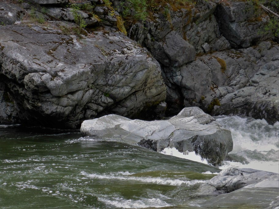
I painted yesterday at the river and I wasn’t happy with the results. Ugly is as ugly decides! I realize too late that it was the problematic value platform….again. This was my scene.
Here is my painting, peek, don’t look too closely, very ugly. I decided it is good for my ego to show the uglies.

This painting kicked my value butt big time. I had to admit that I bit off a big bite, more than I could handle because I realized that I had promised myself that I would be doing a value sketch before starting my painting. I lied! The sun would shine and then the clouds would start passing over ahead and of course it was mostly cloudy when I painted this view. I also realized that I have been using rough 140# without utilizing the wonderful attributes of the paper. I had that in mind and also fighting the values. Ugly happens to the best of us!


Myself perched on a rock trying to paint, my “granddoggie” enjoying the river and daughter Amanda and her husband, Luis. All having a wonderful day, no fish, not a decent painting but fun regardless.

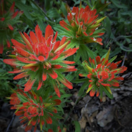
Alright, we needed to look at something pretty.
Today I decided to combine yesterday’s plein air excitement and today’s paintings done at home. The first one is based upon some pictures I took of a local flower, Indian Pink. I am including the reference photo because well, it is pretty.

This was difficult and then easy, at least it felt that way at first. When I deactivated my needy brain for “order”, I had an easy time. I decided to dance with watercolor and boy did we kick up the paint! Interesting how in the past I would freak out inside because things would veer from my idea of what I intended. The senario would be that I would continue on with the freak out plane for the entire ride. This time around, I settled for the chaos and decided to dance this African style dance that Watercolor decided was the way to go today!
Since I was having a glorious time, the painting below came about from a reference photo of a redwood tree that I had taken some time back. I probably could have worked on getting my yellow and blue to mix more properly to get that mossy green in the tree. Maybe another painting, another time. Regardless, I am learning to let go of the picture in my mind or copy a reference photo to the T. This exercise in a way was a loosening up of my ideals. For me that is a trip to the moon! I might go back and give it more depth or I might just leave it alone, or perhaps it might be artist muscle exercise.


What I learned:
- Make good use of rough watercolor paper, learn how to dry brush like the master watercolorists of times past.
- Freaking out because I am supposedly losing my control or grip on the painting only keeps me frigid and continuing the freaking out feeling.
- Allow the gap between my ideals and the outcome to be wide or narrow, it doesn’t matter in the scheme of things.
- Be willing to dance the waltz, the two-step or a wild African dance, dancing is dancing and it’s fun!

I’m loving your daring series… so many wonderful things I’m learning from you! Beautiful work!!😍
LikeLiked by 1 person
thank you Charlie…..we will discreetly ignore that ugly plein air. lol 🙂
LikeLiked by 1 person
I must confess Margaret…. I respectfully, disagree. your river painting as I view the tones, is nearly 100% spot on. can’t get much better than that. your rocks (tones) are great. the water is very good. and perhaps you could…. crop the bottom by one inch to lift the design, ? But, it is tonally very good. (this is just my take on how I’m seeing it from my computer) 🙂
LikeLiked by 2 people
LOL! Perhaps I had a bullwhip over my back on this one? and you like it? hehe…..but you have to bear in mind that I hold my work up to the best of the best. I expect a lot! Maybe when I say “value” I meant interesting and colorful? am I confused or what!? I see what you mean. I went back and looked at it with my “tonal eyeglasses” on. Yes, I see your point, still ugly though the values are there! I think that the subtlety of the scene was making me feel like I was not nailing it. Whew, I am thinking that I am too hard on myself. I feel happy and open about it which is 80% better than how I used to feel, so that is an improvement. I am so glad that you took a look and spoke your mind Debi, it helps. I am always so ready with that whip, flicking it for effect. lol
LikeLiked by 1 person
darn whips! banish them!!
so glad you feel a bit happier now Margaret. I liked the painting, and thought the tones very good. 🙂
LikeLiked by 2 people
lol….yep, banish those whips! thank you 🙂
LikeLiked by 2 people
yes indeed!
LikeLiked by 1 person
I thought they were all fabulous. As always, great work, Margaret.
LikeLiked by 1 person
Thank you! 🙂
LikeLiked by 1 person
Wonderful explorations in watercolor! Here’s a tip that might help with that ugly issue or vague platform – use it as a jumping off point and pretty it up however you like ! Doesn’t have to be true to the real … make it extra-real!
LikeLiked by 1 person
I was waiting for ugly – and I did not see it at ALL!!!! As I read and moved through your wonderful post, I loved each painting – so different – yet so unique and each with its own wonderfulness. Thank you so much for sharing, Margaret. I adore your learning tips!
LikeLiked by 1 person
hehe….my learning tips, lol yep…I should call them my “re-learning tips” I guess someone’s ugly isn’t another’s ugly. Did you notice how often I used the word ugly in my entire post? too many, ugly times! including this comment. Thank you, you are such a doll! you made my day Jodi 🙂
LikeLiked by 1 person
oh I know how you feel – watch for my post tomorrow! LOL! I still have mixed feelings about the beauty/ugly of it! 🙂
LikeLiked by 1 person
I will be looking for it! 🙂
LikeLike
Margaret, I agree with Debi 100% on this one! I love the first one and I’ll tell you why. I love the shapes, it feels real, it has energy and it has lots of light! Love the colors. Adore those. I like everything about it. The top left rock is sensational, love the colors and shapes, just adore. The second rock, almost as good. Love the colors in the water, and I think you used the rough paper well. Mostly I love the Light. Lovely Light for me steals the show! I think you’re doing fabulous and you are much too hard on yourself. Always look forward to seeing your work! ❤
LikeLiked by 1 person
what? I guess I don’t see what you both see but I’ll accept it. 🙂 lol
LikeLiked by 1 person
You brought color in and made it sing to me!
LikeLiked by 1 person
As the others have said, I don’t see any ugly at all! In fact I think your first painting is great and I wish I could paint like that. Love the colours in your tree painting too – what an amazing and mesmerising subject you have there.
LikeLiked by 1 person
thank you….. this response is amazing me! lol
LikeLiked by 1 person
I love your interpretation of the river motive. I think the values are perfect in your painting and i like the color-composition, too. Ambitions are good but you should not be to harsh with yourself. I think it is very well done.
LikeLiked by 1 person
awww thank you! I must be too harsh, I didn’t have a clue how much so until this post! 🙂
LikeLiked by 1 person
Rocks! Yes! I think they’re perfect. You captured the shapes, the values, and the spirit. What more could a rock-rocker like me ask for? I enjoyed the parade of paintings. Each is so different, but they each represent an aspect of you as an artist. A fun little journey today to the river — and back! Thank you for taking us along with you.
LikeLiked by 1 person
Thank you! If I ever stop venturing to the river and rocks, I would either be dead or too old to venture there. lol
LikeLiked by 1 person
I wish we had more scenic places nearby to venture to. I know, of course, that we can find beauty wherever we look as long as we’re willing to look, but I’d love to have a river or even a stream close by. The best I can do is drive across town to the city park, which is beautiful, but it’s not quite the same as hiking down to the river. I have to drive a lot farther to do that. 😦
LikeLiked by 1 person
😦 sometimes I forget that people don’t have the access to the river and nature that I have. One time my sister-in-law coming out to our place for the first time, her first question was….”what do you do when you want to shop?” “wow, you are way out here!” I don’t think that she liked it. I love it! Beauty is everywhere, even if it is in the park, other people and the images that you produce. 🙂
LikeLiked by 1 person
Now, it if will ever stop raining — and warm up again — I’d love to venture out and enjoy a bit of spring before it’s gone.
LikeLiked by 1 person
Beautiful rock forms Margaret – nice edging, value treatment for the darks and lights. Too hard on yourself, this was a lovely water scene.
LikeLiked by 1 person
wow…..I almost threw it away! lol thank you! I am too hard on myself, the feedback here has really helped me realize that. 🙂
LikeLiked by 1 person
Your first painting of the rocks had it all. Movement, drama, colour, tone
LikeLiked by 1 person
thank you!
LikeLike
Margaret – your rocks rock! I have to agree with Debi – this is a great painting that achieves value in all the right places. I was surprised to read you were so disappointed with it!
Also, I wanted to shout THERE’S A BEAR!! but then I realised it’s the dog……
LikeLiked by 1 person
wow! I have gotten so much feedback on that painting that I am really amazed. You know what? I almost threw it in the trash! I think it needs some pizazz, don’t know what….hmmm. It was such a beautiful but subtle scene which I think messed with my brain.
LikeLiked by 1 person