
The weary carries on….that’s me two weeks into my challenge. Although I planned on taking Sundays off, I am giving it some consideration because my daughter and son-in-law asked me to accompany them to the North Yuba to fish. Of course first thing I thought of….I’ll plein air paint! Again? yes! again! We’ll see tomorrow if I do or not. I might not post until Monday if I do go. I need a break and so do all of you!
I thought of doing an exercise based on Debi Riley’s post yesterday Easy Watercolor Flower and I planned away until I realized that this is getting detailed! what? Why must I always go to the extreme? This post is full of exclamations, so sorry but I am feeling exclamatory.

Yep…detailed, nothing even vaguely familiar to what Debi was referring to. Another day for another painting, I say. With this painting session I learned:
- We are not going to even talk about values right now…nope, too late.
- Keep the original intent of the painting clear and alive throughout my painting session.
- If I am too tired or weary, don’t push the painting. Do a sketch or think about art, post that, just a friendly reminder.
- Keep in mind the color scheme and design, too late to realize that I had a purplish blue background for a purplish blue subject….hmm.
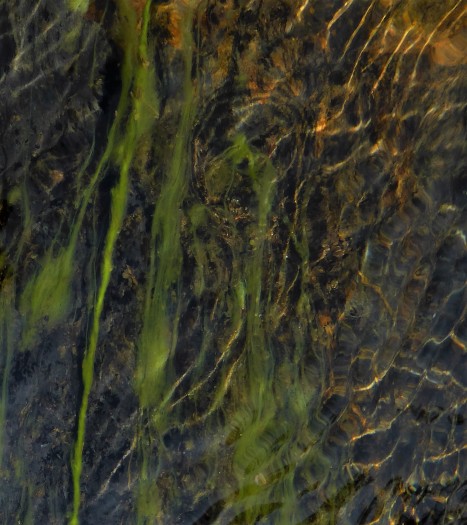
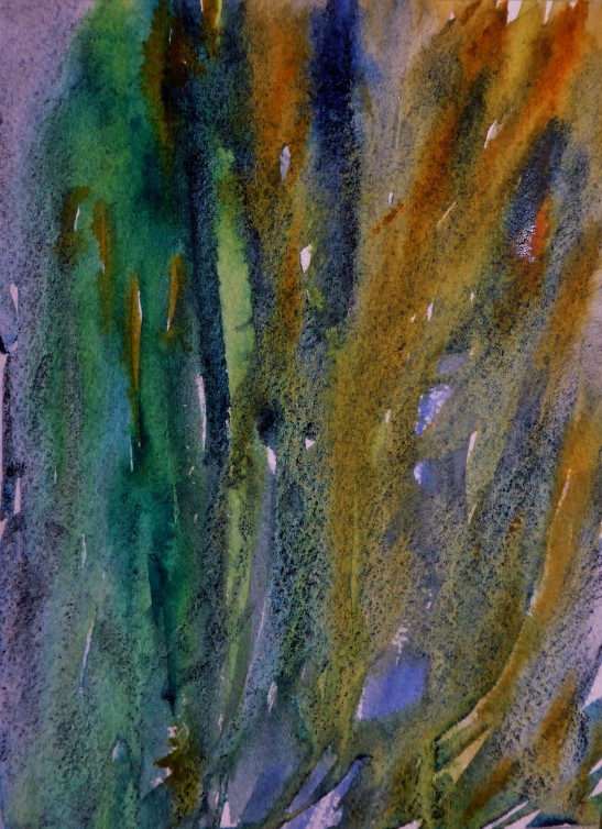
Now since that painting session didn’t live up to my plans….I decided to get crazy and go for it. Here is my reference photo that I shot yesterday while at the river. I do believe that I will do a planned out abstract painting at another time but for now I wanted to use it for a loosening up exercise. I thought of this too late but today was a little backwards anyway.
I almost cried realizing that one of my favorite colors is almost gone, Daniel Smith’s Lunar Blue. It is such a gorgeous color and all those little blackish blue dots is the result of the granulation that occurs bleeding into the other colors. Simply yummy!
Colors used on this painting was quin. gold, aqua ultramarine, fr. ultramarine blue, lunar blue (all Daniel Smith)

love the abstraction, Yuba flow! the lavender does indeed have enough LMD tones. and your photo is wonderful, Creative and art! posting every single day… is a challenge. 🙂
LikeLiked by 2 people
oh, I guess I was looking for a big punch, lol yes, I love extremes. Thank you! you inspired by your posts. It is a challenge to post every day but I figure that it has been helping my art and my stick-to-itness.
LikeLiked by 1 person
yes, sometimes the wide extremes are great! I’m glad this challenge is helping your art too!! fantastic 🙂
LikeLiked by 1 person
Nice! It looks like you are having success with your May watercolor challenge. I love that simple lavender.
LikeLiked by 1 person
I am loving it 🙂 tiring, challenging but….loving it!
LikeLike
Great combination of colors Margaret and beautiful flow I love it! Carolina
LikeLiked by 1 person
Thank you Carolina! 🙂 I was feeling the flow….lol
LikeLiked by 1 person
ahah
LikeLiked by 1 person
This is cool! I can never seem to abstract anything…. hehe… love that you went for it and the result is awesome! Love it! 😍Still a wonderfully mossy feel to the painting even without the reference.
LikeLiked by 2 people
Thanks Charlie 🙂
LikeLiked by 1 person
Well, I am learning what a Spanish lavender looks like – new to me! Tell me more about this plant – your watercolor is moody to me, and the plant is interesting. Congrats on your challenge stick to it ness and plans for plein air painting
LikeLiked by 1 person
I bet it is moody because of “what to do….what to paint?!!!” and then while painting it I’m thinking “darn” that I was not going with what I originally intended! lol yep…..I love Spanish lavender, it is beautiful when you have large plantings of it and intermingled with the French variety. I hope to get more especially because the deer won’t touch it….a plus for me and it is in my….get ready….my “deer garden”. I have all kinds of plants that supposedly deer won’t eat. It is an experimental hit and miss garden. 🙂
LikeLike
Margaret, I am so enjoying painting with you and Debi this month. It is a blast to see what you both are doing each day. Ok. I like the flower very much, it looks technically very good and I do love the detail in it. But the photo and the WC abstract are both, to me, WOW pieces. They have so much life and energy in them! They are boinging off the screen at me. That last one, woo! It is blowing me away! It reminds me of something Debi would do (and I mean that as a most sincere compliment). I see this as you letting loose,setting yourself free, choosing colors you love and saying “It’s time for you to play, frolic on the paper” and then turning them loose. Letting the medium lead and then stepping out of the frame. Wonderful, lively, strong. Well done!
Ok and you may think I am a bit of a goon, but I just happened to be on GR today and noticed your avatar there and of course put two and two together and realized you are the same Margaret I met there who rocks the pastels! So this is feeling even extra cool and grand! Loving what you’re doing. I am seeing you really soaring in the freedom of watercolor. Congratulations, my friend! 💜
LikeLiked by 1 person
LOL! I thought all along that you remembered that we first met on GRs…..so funny! I agree, that first watercolor was kind of fun but all along it was like….hmmm tight….too tight….man!….can’t I just loosen up for once? then I decided to loosen up using that photo of mine of the river….let’s see, it was a mere 5 minute painting, maybe 6 minute tops! The first one perhaps 1 hour! lol goes to show that you don’t have to put a lot of labor into a wow painting! thank you for your comments, they mean a lot to me and I love your observations. 🙂
LikeLiked by 1 person
I do remember us connecting here, but busy season and exhaustion tend to obliterate my memory even further than it already is. I think it was the blog title that further threw me off and I had you as someone else completely. As George (Seinfeld) would say, “it’s not you, it’s me” and my horrible memory. Boy, and I think you nailed it re the few minutes vs an hour. So so true. Just the way it works sometimes. Really glad you’re enjoying your month of watercolor!
LikeLiked by 1 person
I’ve just tried some Daniel Smith watercolours – he has some fab colours doesn’t he? They really work in your abstract!
LikeLiked by 1 person
I only buy the 15ml Daniel Smith colors now and I think that I’m happy. 🙂 thank you….I was quite happy with that abstract.
LikeLike
The abstracts are really eye-catching. I love that you took that up-close photo and then “translated” it to the page with such gorgeous colors. I was also inspired by Debi’s post about Easy Watercolor Flowers, so I tried painting a “loose” flower, too. My experience was similar to yours — my painting is in a post that’s scheduled next week — but it was a good practice. I learned from it. I have French lavender growing with my herbs, and I was actually thinking of painting it. After I looked at it again, I figured it might be a bit more than I could handle. Maybe I’ll give it a try and once more see if I can capture it “loosely”.
Thanks for sharing your experiences during your month of painting madly. It’s fun to tag along for the ride.
LikeLiked by 2 people
lol you put it so correctly “month of painting madly”! I had to laugh when I read that. But….it has been mar…ve….lous! 🙂
LikeLiked by 1 person
I think you’ll look back at the experience and be very grateful for it. 🙂
LikeLiked by 2 people
I sure will! I am thinking of posting all the photos of my paintings and doing a slide show at the very end of my challenge, it will be fun to view it in a different perspective. 🙂
LikeLiked by 2 people
What a marvelous idea! Yes, please do!
LikeLiked by 1 person
Your watercolors are amazing. Let it flow!!! 🙂
LikeLiked by 2 people
thank you…..I’m trying 🙂
LikeLike
You are definitely going into a more dreamy period with your paintings! I like where this is going! I hope you’re having a wonderful weekend my friend 🙂
LikeLiked by 2 people
Margaret, I can’t stop thinking about your Yuba Flow painting! Could you give any tips on how to achieve these bold streaks of color without making mud? How did you do it, evil genius *cue the cackle*? Also, were you using 300# or 140# wc paper for that one? I am totally in love. Were I you, I’d be making these all days, in different color families, lol. So, so gorgeous. It’s not often that a painting won’t leave my mind, with all the inspiration always bombarding us on WP. This one is unforgettable. Bravo, my friend!
LikeLiked by 1 person
wow! I had no clue and I look at it and am thinking….hmmm if only I had done…that….or this….it would had been a better painting! lol so it is on 140# on wet paper but when the shine is just about gone otherwise it does that creepy crawly spidery look. Sometimes it looks good but I wanted a cleaner/mingling effect. I used opposites, let’s see I used the colors that ultimately I hope would mimic what I was looking at. Lunar blue and the ultramarine blue are granulating colors, so they will mingle beautifully. I guess if you wanted to avoid mud, don’t mix them on the palette, let them mingle on the paper…and use primaries as much as possible and less than 4. I did not go back and forth and fiddle with the colors. I simply took my brush and swipe in the colors….don’t over-brush, I used one swipe for each color, maybe another just to add an affect. I made a few mistakes and didn’t have enough color so you’ll see the awkward sharp edges on mine. Oh, I also tiled my board so that way it moves and grooves how you want it to go. Also, choose a reference photo that truly inspires you, it helps you with your choices and colors and it keeps you out of your head or wondering “what do I do?” of course I only say this because I need the motivation and focus when I did that abstract. I have a few more of those photos if you want to use one to base a painting from it….just let me know. 🙂
LikeLiked by 1 person
SO much for me to learn just in your response there! I didn’t know granulating colors mingle well, for example. OK, so you make it sound so easy by saying you swiped in color! hehe! And tilt and move & groove, ok, I can try this. I will try and research and see which of my colors are granulating and try to only use those. And when the shine is just about gone, otherwise creepy crawly is also very good information because this is something I frequently don’t have the patience to wait for, or I just plain forget to do it. Thank you very much for these tips! I will try. I’m thinking may be better on actual wc paper vs. that aquabord; we will see what the mistress doth want! Truly, thanks Margaret, much appreciated!! Oh, and I guess you got your brush very juicy before swiping? Kind of thickish paint, vs. puddly, I’m guessing?
LikeLiked by 1 person
My creepy crawly term is definitely not a watercolor term! I am sure that there is a name for it….it is too much water on your brush and too much on your paper and it spiders everywhere. Debi would know the term. I say swipe meaning, be bold and put it on and don’t fiddle it or brush it to death. I wet my brush, lightly dab my water to take off that big drip and then take a glob of pure paint straight from your well. It all depends on how much water you have on your paper, your brush and paint itself. I didn’t put my paint from the well onto my palette to mix…straight from your paint source, be brave and be bold! You might have to play around with it in order to find out. I hope I helped. Oh….forgot to mention, I chose colors that didn’t granulate as well, you want a happy blend…..a balance. Granulating colors are great but too much partying can be quite tiresome. lol I know, my analogies are always popping in all the time. 🙂
LikeLiked by 1 person
Yes, you definitely helped! I knew what you meant immediately by creepy and crawly, I just love the way you put it! (((((M))))) I need to learn to be bold with my brush strokes and this seems a good exercise. Bless you!
LikeLiked by 1 person
Okay….now onto painting….what to do!???? have fun!
LikeLiked by 1 person
You will not have any problem coming up with ideas, living in paradise as you do! 😀 I will have fun (and with wc?? amazing) Thank you Margaret!
LikeLiked by 1 person
anytime….dear friend! 🙂
LikeLiked by 1 person
🙂
LikeLiked by 1 person
I haven’t had a chance to read through the whole post — I wanted to say something first because some of your remarks about plans, etc., prompt it. I realize that you’re striving to learn so there are lessons about all this watercolor stuff. But you have to allow also that sometimes something miraculous just happens and you might not know how it came about. That’s what I see in this watercolor of the flower at the top — it is really stunning — completely transcending any sort of lesson or what have you. It’s an assertive, beautiful image that seems to exist for its own reason. Really marvelous.
LikeLiked by 1 person
In my remarks I must seem like I’m often saying the opposite of whatever you propose — not trying to be contrary, really! Your remark that you need to avoid pushing the painting when you’re tired has prompted one of my topics. In my own practice of art, I sort of reserve the weary times ESPECIALLY for pushing toward unfamiliar territory. When I’m tired, I am less inhibited. The whole business of being tired provides an out — if it doesn’t work, I can blame my fatigue so why not just have at it? As a consequence of the perfect excuse for freedom, I find that when I’m tired is kind of the perfect time for doing something difficult because I can sail into it without undue expectations about results. Instead I can just think very directly — I want to do “such and such” and set about working.
Regarding working a blue subject on a blue background — that just means that you think about tonality — it leans toward monochrome — it becomes a drawing (that element) except that since you’re working with color some of the distinguishing features between subject and background might include differences in shade of blue, or might be warm/cool differences, or as already mentioned tonal differences.
LikeLiked by 1 person
Thank you! I never think that you are being contrary and even if you do in the future….I would count it as something positive because I see that you are a “digger” like I am and worth listening to. 🙂 if that makes any sense. I agree about being weary or being tired is often a good catalyst to getting more loose or letting it rip! I had this idea that I had to be loose, well, Mrs. Watercolor had other plans! And I think sometimes I want an image to blow me out of the water, always looking for the “have to put sunglasses on” painting!…..I know I’m for the excitement but often the subtlest painting can be awesome and full of impact. After I looked at it on my desk, I got to thinking….hmmmm….not so bad! what is the heck my problem? Thank you for your keen observations! I got to thinking about the choice of colors for the background and my image….yes there is a monochrome going on….what’s wrong with that Margaret? I am my own worst critic and enemy! lol
LikeLiked by 1 person
I was wondering about the term “tight” (I did finally get round to reading the whole post and comments.) So I looked it up. I have often heard it used but am never quite sure what people mean by it. Someone on the internet defines it this way: “The words tight and loose in painting have to do with a sense that the artist painted with ease, and not with difficulty.” [“Loose being the later, and “tight” seeming to be labored.] Used that way, many exceedingly difficult things in art might look graceful as though they were easy the way that Olympic caliber skaters make skating look easy when that’s the last thing it is.
However, many things that are difficult look difficult. A violinist playing a swift line of melody can pull the notes with the utmost grace, but we still know that the passage is difficult to play!
Somehow the word “tight” in art seems to discourage people from a linear approach or to an approach that involves what the optometrist would call “acuity.” Used in that way, your drawing of the flower is actually loose. It depends upon line but it is not especially linear. There’s a lot of give in the edges. You report having spent an hour making it, but it doesn’t in any sense look labored. To the contrary, it has a naturalness and ease about it. Also, while I was having my say about painting blue on blue — just in response to your commentary in the post — when I scrolled back up to look at your picture again I didn’t actually notice any of the problem you alluded to. Sometimes the difference between figure and ground can be daunting. But your picture is direct and legible, graceful, engaging. I call that success.
LikeLiked by 1 person
Thank you! I think that in my mind tight is the opposite of brush slinging and not a care in the world! lol If you look closely (you did) it isn’t as “tight” as I thought. You are correct…..it works! I have to get straight in my head what it is that I am going for. I think that in my artistic mind, I want to be frivolous, expressive and care-free….thus….loose! lol And then I am thinking perhaps what I am really vying for is comfortable….sitting back and putting my feet up with this medium. Even though it can keep you on the edge of your painting seat! oh the ins and outs of this artistic life! I always love hearing, well, reading what you think. Always speak up….always 🙂
LikeLike
Ironically the way to be able to manage an expressive and (seemingly) carefree technique is practice — the same as for a musician. The whole art of painting can be summed up as putting the right color in the right place. I think of it as being like target shooting. But we hope that Annie Oakley wasn’t just swinging that gun around! The hour long watercolor is the one that will lead to the path of expression and ease.
Well, anyway, sometimes it takes time — literally — to decide what qualities a picture has. You’re so near in time to these pictures. A week, a month, a year later you think and feel different things when the picture is there by itself without the reference.
LikeLiked by 1 person
I think so, laying aside reference photos and valuing a painting on its’ own merits is important. I like that analogy of a musician and practice. 🙂 I’ll remember that.
LikeLiked by 1 person
Wonderful series! 🙂
LikeLiked by 1 person
Pingback: Daring Watercolor #23 Final – Yuba Gold