

Now we are on a roll! Considering that I woke up with a headache, I decided to go ahead and paint anyway. I decided on something abstract and loose and this photo that I took on a trip to the North Coast of California at Patrick’s Point State Park, our favorite place to vacation.
I tried to get my photo to match up with my painting though the blues are richer (in my painting) and there is an ultramarine turquoise that isn’t showing up so crisp and gorgeous as it should. Also the golds and yellows are richer in real life. At least you get the idea.


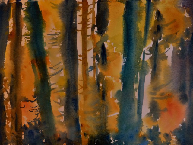
A few close-ups though they are a bit fuzzy I think but I like close-ups.
I accidently put my brush in Cad. Yellow and dabbed it onto my painting and I went “OH NO”! I have this intense fear of using the Cads of the paint world and I bought them when I first started buying my paints. This cad yellow has been hanging with the others for a while now and I am happy to say cad yellow is not such a bad boy! As long as I don’t mix it together with another opaque. I allowed it to run over to play with the other colors on my painting. It didn’t need any coaxing whatsoever….all by itself. Poor Cad yellow has been a lonesome paint for a very long time! I will never fear cads again.
Now to put up one last photo of a painting taken from this photo that I had done last summer. I was more careful and perhaps tighter on this one. I am not sure if I really like it. Which one do you all prefer? Don’t be afraid, I won’t bite. 🙂 I didn’t care for that branch that comes across on the left, I haven’t figured out what to do with it. It looks like a hot mess to me.
Onward march….happy to say my headache is now gone. I might now go work on my painting based on a Edward Curtis photo for the rest of the day.


BRAVA !
Aleks.
LikeLiked by 1 person
Beautiful!! Both of them equally. They’re so different in style it’s almost impossible to compare. Though, I like the loose watercolor a lot!😍
LikeLiked by 1 person
cool! me too 🙂
LikeLiked by 1 person
hope your head ache is gone by now! I like both Margaret, for differing reasons: the sheer freedom in the one, and then the tonal ranges in the other is so good! can’t pick a ‘favorite’ tho.
LikeLiked by 1 person
I like the branch that you aren’t so comfortable with. The angle really jumps out. But I like the looseness of the water colour one as well
LikeLiked by 1 person
Thank you….I might give it another go at it, we’ll see. 🙂 always something to entice one to try it again.
LikeLiked by 1 person
This is smashing, Margaret! I love the last painting. I agree I would want to change that one branch, although it does add interest! I like the freedom in the first painting and it looks like you were relaxed and having fun, so that’s what I’d say I like best about that one. You are taking on really challenging subjects IMO and I think you’re making great progress!
LikeLiked by 1 person
I always like the “turn the screw” on myself just a bit, don’t I? yep, that’s me! let’s see about challenge!
LikeLiked by 1 person
You really are tough on yourself! But it seems to work for you!
LikeLike
Oh and thanks for the info about cad yellow. I really like him, but I didn’t know mixing him with another opaque is a no-no. I have probably done it countless times and disliked the results, but never figured out what was wrong with the mix(es) that yielded that. I love that he is so bright and vibrant!
LikeLiked by 1 person
I didn’t use Mr. Cad for all the yellow areas but just a few spots and he did frolic a bit and gave everybody a little exciting time. lol
LikeLiked by 1 person
lol 😀
LikeLiked by 1 person
Turned out beautiful!!!
LikeLiked by 1 person
Margaret, first good for you for persevering through the headache! I like them both, the freshness of the first and sponaneity, but I think I like the more finished quality of the second. That branch on the left doesn’t bother me at all, and I love the way you created the shape of foliage on the right with negative painting of the dark.
I know what you mean about cads. My first teacher suggested my palette and I got cads because of him, and I rarely use them. however I took a class with Michael Riordan who uses cad orange in a very light wash and cobalt blue as his underpainting when doing plein air. So I have moved that one back on to the palette.
LikeLiked by 1 person
Oh you mean Michael Reardon from the Bay area? If so, I have met him at the Sonoma Plein air festival….love his work. I need to look into how to use the cads judiciously because I know they can be awesome, I had that experience just today with this painting. I wouldn’t mind trying to paint this subject but lean more towards the 2nd, tighter one. 🙂 This whole experience has been so fun, what a challenge! And for me to post my paintings because I am so darn finicky.
LikeLiked by 1 person
Yes, that Michael Reardon. He came to New Mexico for a workshop in the fall. he has his first book out too which is very good.
LikeLiked by 1 person
I’ll have to look into getting it. I really like his art and his personality. 🙂
LikeLiked by 1 person
I like the bottom one the best – for me, that glimmer of light and the light shining through and the way the branches are in the lit part are very effective and magical.
LikeLiked by 1 person
The second version . I think you captured the light better . Sorry I’m not gifted with many words .
LikeLiked by 1 person
I agree though I don’t like the muddy look to the silhouetted trees; perhaps trying for a better version? I am always hoping to get it right. 🙂
LikeLike
Hi Margaret, beautiful paintings as always. My favourite is the second one, I love the light in it, very stunning. Being a perfectionist also, the left branch would bother me too, without that I think it’s perfect!
LikeLiked by 1 person
I wasn’t just me then! I am glad that you agree with me about that branch. I am planning to do a “re-do” not sure when but hopefully this month. 🙂
LikeLiked by 1 person
That is pure magic Margaret! I love the original photo, and the last photo of the painting. You are very creative, and I really like you style.
LikeLiked by 1 person
Thank you Maria….:)
LikeLiked by 1 person
Your work is very inspiring.
LikeLiked by 1 person
I join the crowd when I say I think the 2nd painitng has really captured the quality and depth of light but your first has a lovely loose quality about it. My you manage to paint a lot! I must do better !
LikeLiked by 1 person
I have been pushing myself on this challenge. Usually I don’t paint everyday and since the weather has been rainy it sure helps! Once the weather gets better I have a lot of outdoor projects to get done, so the pressure is on! 🙂
LikeLike
I love the tangled forest! The calligraphy of branches that intersect the trunks both + and – is pleasing.
LikeLiked by 1 person
thank you! 🙂
LikeLike
Love your spirit. “Neither snow nor rain nor heat nor gloom of night …” etc. As artists we can’t let ourselves be out done by the mailman.
I admit to being flummoxed however about cadmium yellows. Certain mixtures would be impossible to obtain without it. I like cad lemon, cad medium and cad orange and have used them all very liberally in watercolor. I like to use some greens out of the tube, but I like mixing and adjusting them also. Cadmium yellow added to the blues and greens makes gorgeous colors of different character and temperature.
As a rule, it’s a good idea to mix everything with everything — at some juncture — just to see what you get. In this case, say, cadmium medium added in turn to: light red, aliz crim, cerulean blue, ultramar blue, phthalo blue, ochre, burnt sienna, black, phthalo green, hooker’s green, sap green, violet, and of course to white. Lem yellow to each of these produces radically different effect than medium yellow, etc.
If you’re painting something in watercolor that’s yellow, how would you manage?
LikeLiked by 1 person
I will start playing around with my cads that I have in fact all three; yellow, orange and red. Good question! how would I manage with painting something yellow with watercolor, that sounds like an upcoming exercise to play upon. 🙂 as always I love hearing from you and your thoughts, which always helps me. Always!
LikeLiked by 1 person
Before reading anyone else’s comments, I want to say it’s a hard choice between the two, but I think I prefer the first one you posted. I like the colors in it. The turquoise really sets the other colors off. BTW, I “discovered” a nice little cadmium yesterday. It’s Cadmium Red Hue. I was a little hesitant to try it but used it to mix a skin tone for another portrait I’m painting. I really liked it. I don’t have a cadmium yellow in my watercolors — or if I do, I’ve overlooked it — but I might be willing to try it out. I’m doing a lot of reading and research on pigments and paints — there’s so much to learn!
I really liked both of your paintings today, but again, I like the first one better. Now, I’m going to go back and read all the other comments.
LikeLiked by 1 person
I like that you first looked and then answered without being swayed by the other comments, that is very thoughtful 🙂 I will also be doing my research as well. Debi has so much info about color, not sure if you follow her but it is very informative. I go and read her posts little by little because there is so much to absorb. 🙂
LikeLiked by 1 person
I love Debi’s blog and all the information she shares. Reading her posts was the reason why I decided to start learning more about the different pigments. You’re right about there being a lot of information to take in. It’s all fascinating, but I wonder how I’ll ever remember so many things! Of course, it’s the “hands-on” experiences we have that really teach us the most, I think. Learning by doing — and by making lots of mistakes — really helps me remember things better. There’s a fascinating history lesson behind each pigment, too. The more I learn, the more I want to know.
LikeLiked by 1 person
Yep, I agree, hands on and I have found that going back and re-reading about it all and on and on it goes. Eventually it starts making sense. 🙂
LikeLiked by 1 person
Yes, as I’m reading I find more and more questions in my head…like two different tubes of paint with different names but the same pigment — both from a single manufacturer. I wish I could just try them all!
LikeLiked by 1 person
I have a problem with being enticed by color, I would buy them all if I could but that just means trouble! moneywise and I know with watercolor it can be a trap and very complicated painting!
LikeLiked by 1 person
I guess it’s probably better to have fewer paints and love them all than to have dozens and not like them or use them. 🙂
LikeLiked by 1 person
exactly!
LikeLiked by 1 person
Beautiful images, your paintings are very good. It is really challenging if the source image is already so stunning. You have to add something of yourself, but how? I think you did very well.
LikeLiked by 1 person
Thank you! It is a challenge and I am stabbing away at it, a day at a time. 🙂
LikeLike
Wow your work is so expressive – and bold – this is inspiring – your paintings burst with light – I like the energy of the first more but I also like the studied approach of the second
thanks so much for making contact in this wonderful blog-world
LikeLiked by 1 person
I do love light that is for certain. I don’t know about my work being impressive…you are being far too kind. At this point I feel that I am re-learning watercolor. I am mainly a pastelist but love watercolor. I decided to take on a solid month of painting solely with watercolor. It has been a challenge, that is for sure. I decided I need to get moving on this “learning” and stop planning on it. Thank you for your comments because I need all the encouragement I can get without threatening and begging! lol
LikeLike